Rafferty & Co Mortgage Broker
Rafferty & Co are mortgage brokers located in Hartlepool, but serving clients across the UK. The business is owned by David and Sharon Rafferty. They build lifelong relationships with their clients and their service doesn’t stop with the initial purchase mortgage, but continues with a mortgage review service that helps clients keep track of their mortgage renewals. They remind clients in advance on when their current mortgage deal ends and they present them with a range of options available, making the mortgage process easy to manage. Rafferty & Co wanted a new template website for their business and came to us to explore the available options.
Bronze 1803
The template of choice
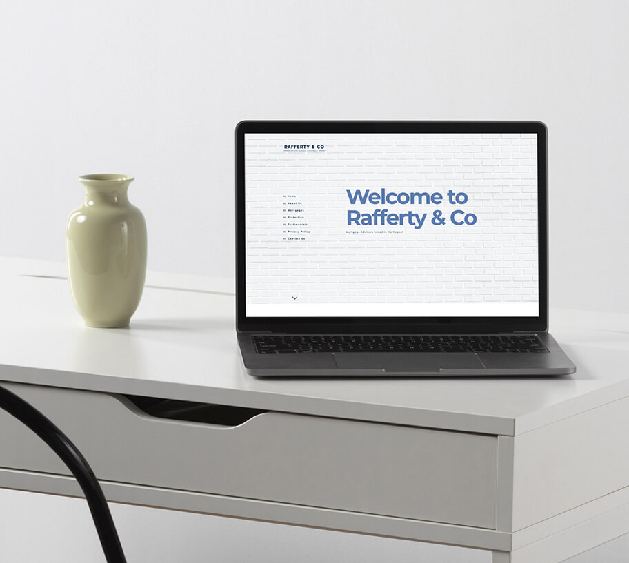
David and Sharon chose our Bronze 1803 template. We have three different designs within our bronze level of template websites and all three are great for businesses who are looking for a simple low-maintenance website that looks good and functions well. The Bronze 1803 design is a great choice for clients who want their website to stand out as it’s a much bolder and more non-traditional style than our other bronze options. The design features a big bold welcome on the Home page combined with a large image to get the attention of visitors right away. The navigation bar remains simple but is also less traditional, as it starts on the left and moves to the top once user's start scrolling.
Rafferty & Co's Bronze 1803 website
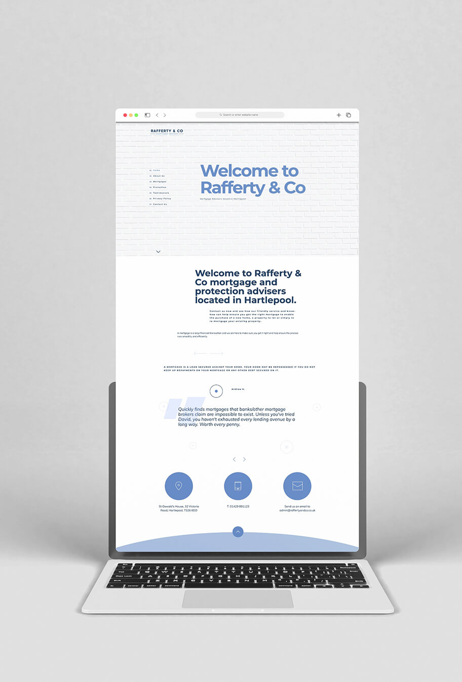
Rafferty & Co’s website is a wonderful example of what can be achieved using our Bronze 1803 template. The website is simple yet highly effective. Customised to Rafferty & Co’s brand colours of white and blue, the website features a brick image representing the walls of a house. This image is consistently displayed on each page, allowing the message to shine and adding consistency across the whole website.
Although simple, the website provides everything that visitors need when they land there. With plenty of white space, the design is crisp and clean giving website visitors a great experience. The navigation menu is easy to use, further enhancing the overall user experience.
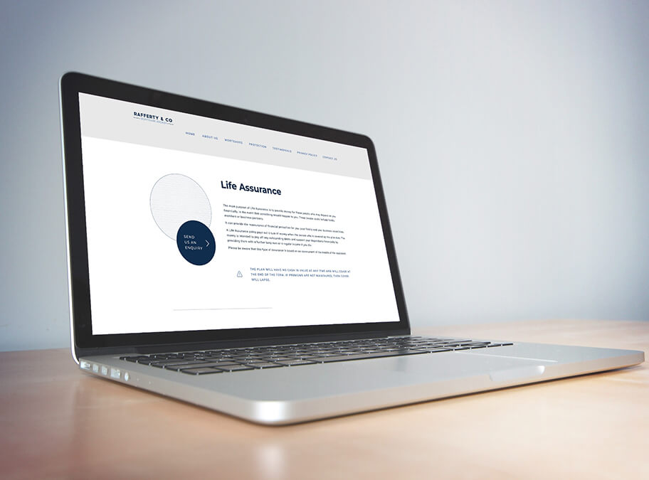
The service pages have calls to action (CTAs) attached to each individual service and every page of the website has Rafferty & Co's contact details displayed prominently in shapes utilising the brand colours. Having the menu displayed at the top of the page at all times also means the link to the Contact Us page is always visible.
Our Bronze 1803 template is a simple yet powerful website that can make your business stand out and Rafferty & Co's interpretation is a lovely example of just how powerful it can be.


