Besmoke
Founded in 2004 by Huw Griffiths, Besmoke offer a range of authentic smoke and grill flavours that enhance cuisine. They pride themselves on being smoke innovators and use the latest technology to achieve mouth-watering tastes. Besmoke is a new client of WEBPRO's who we were introduced to through a mutual contact. When they came to us, they had a one-page website that looked beautiful but needed to be enhanced and expanded on so that they could grow their business online.
Beauty meets function
The brief
When Besmoke came to us, they already had a strong brand in place and some custom illustrations that we knew needed to be incorporated into their new website. They also had a website they already loved, it just wasn't enough to win them any new business. In some ways, this made our job easier, we just had to take what was already there and build on it to give them a website that both looked great and worked to bring in new business.
Key requirements:
- Retain the look and feel of the current website
- Showcase the strong brand already in place
- Consider lead generation
- Balance the need for more content with the desire for negative space
The solution
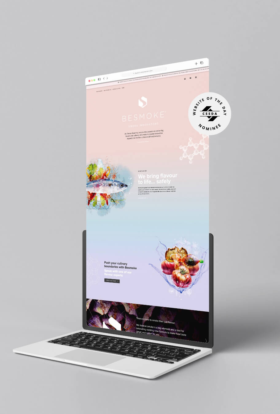
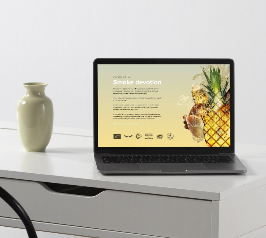
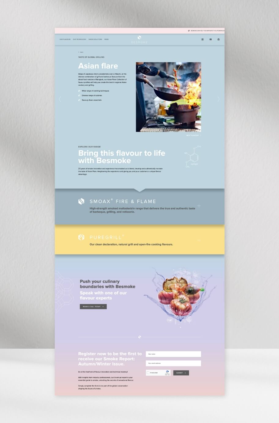
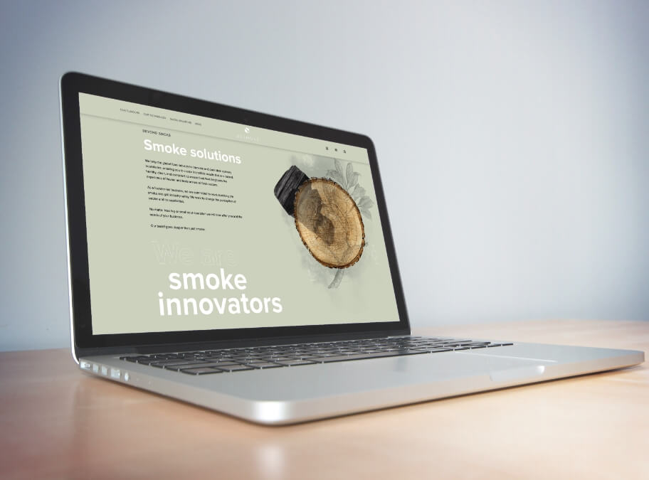
Our solution for the new Besmoke website involved using the range of soft colours already in existence within the brand to enhance the user experience and clearly define the different areas of the website.
The custom illustrations provided by Besmoke were complimented with graphics and illustrations created by us alongside carefully selected stock imagery and some real photographs provided by the client. This mix provides some contrast and enhances the website design.
Graphics and imagery have been used to guide website visitors through the website, breaking up content and allowing space to be created between sections and the use of animation and movement in key areas keeps users interested and adds a unique flair that matches Besmoke as a business.
Top features:
- Clever use of colour to define different areas
- Use of imagery to create space
- Animation that adds interest
- Subtle CTAs that fit with the softer design
The result
Besmoke are extremely happy with their new website and they feel it has built on their initial work perfectly. We’re now working on phase two of the website, which will include adding more content and additional features to focus more on lead generation and future growth.


