Basics of design principles
Design principles are standards and rules that design experts typically maintain when creating their work. For example, you might know that when choosing an outfit 'yellow and green should never be seen', and designers know similar rules when designing images, videos, business materials, logos, websites or something else.
Of course, some designers may try and go against design principles to create something innovative and unique, but history tells us that this rarely works and the principles have been decided on for good reason.
There are lots of design principles that most experienced designers agree upon. Some of the most common design principles are related to:
- Balance
- Contrast
- Hierarchy
- Colour theory
We explain each of these in simple terms below and then apply them to our specialisation – website design.

Balance as a design principle
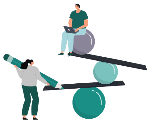
Balance refers to the distribution of elements within a design composition. The general idea is that the distribution needs to create a sense of equilibrium and stability. To achieve optimum balance within a design, the things being designed must arrange elements in a certain way, including shapes, colour, textures and even blank space. Balance can be subjective to an extent, but people often know intuitively when something isn’t quite right. You may want to think about discussions you’ve had when hanging several pictures on a wall. There often feels to be a correct way and an incorrect way – and this is balance.
To dive into slightly more detail, balance can be broken down into three types:
- Symmetrical
- Asymmetrical
- Radial
Symmetrical balance is when the composition is identical on either side, which is an easy way to strike a balance within a design. Asymmetrical balance is when balance is achieved without the composition being symmetrical, often with the use of different shapes or textures or even written content on either side. Radial balance is when balance is achieved from a central point in an outward direction.
Overall, balance is important in design because it creates cohesion and even avoids the onlooker feeling uneasy about the composition of a design.
Contrast in design is the ability to insert different elements within the design while maintaining balance. The different elements within the design are what creates interest and juxtaposition, which is key to get people to really engage with the design overall. The general idea within contrast is to make one or two elements stand out above the others, which ties in with design hierarchy that we discuss shortly. If there is no contrast within a design, the design can appear bland, unimaginative and less interesting. Every design needs a focal point and this is partially created through carefully considered points of contrast.
The most common ways that designers achieve contrast are through:
- Changing colours, especially placing light and dark objects side by side
- Changes to the font, including style, size and boldness
- Changes to the size of objects
- Changes in texture, especially to backgrounds and shapes
- Changes to the position of empty spaces, although balance should still be considered
Without contrast in designs, they are unlikely to stand out against other designs, which is especially crucial in competitive environments like art exhibitions, marketing campaigns and website design. Yet, overdoing contrast can put people off in the same way people can be put off by a design without balance.

Hierarchy as a design principle
Hierarchy within a design is all about creating a sense of order, which helps the onlooker know where to look and the process they should take to scan the design. Hierarchy is fairly easy to get right in simple designs but, if a design has a lot of context and elements, it becomes vitally important. It’s also essential to consider the target market as some cultures are used to reading from left to right, whereas others read from right to left. It’s these smaller considerations that make a big difference.

Some ways that designers influence the hierarchy within their work are:
- Changing the size of elements to denote a hierarchical structure
- Changing the tone of a colour or the colour itself
- The use of visual cues such as arrows to create flow
- Placement is one of the easiest ways to create a hierarchy, often from top to bottom
- The typography used at different stages in the design
Hierarchy is most important in designs that need to create a specific hierarchical structure rather than more creative works of art. For example, hierarchy is especially important in posters, editorial design and website design.
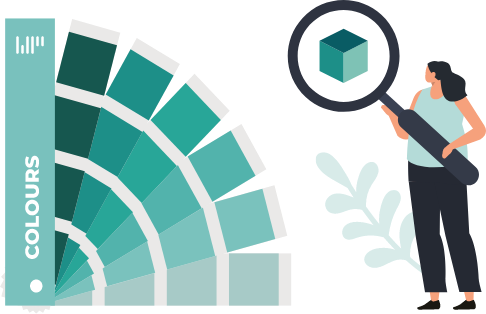
Colour theory is a complex aspect of design theory but can be summarised as how the use of colours interact with each other and the person being exposed to the design. It is one of the fundamental rules of design that some colours are naturally considered harmonious and they 'go' together. Whereas other colours - like our yellow and green example at the start of this post - are not. Often designers will use a colour wheel to help them choose the right colours.
Another key aspect of colour theory in design is colour psychology. It is scientifically proven that certain colours will consciously or subconsciously evoke specific emotions. For example, the colour purple is supposed to evoke a feeling of trust which is why it often gets used by financial service providers. You notice the considerations of colour theory in specific industries that keep using the same colours within their logos, such as technology businesses often using blue logos.
Thus, colour as a design principle is key to ensuring the correct emotions are elicited from viewers and is especially important in any design that has to be branded for business purposes.
Applying balance to website design
Balance needs to be applied to website pages within the design process, especially the home page which is key to maintaining the engagement of the website visitor. Most websites don’t provide symmetrical balance, but they do often create asymmetrical balance by utilising different shapes, images and text. If this isn’t achieved, the page can be off-putting and cause the visitor to leave.
Applying contrast in website design
Contrast in website design is the ability to navigate the website visitor’s gaze to certain elements of the page. This can be achieved in all the ways discussed above but is mostly done with header images, videos and the variation in size and font of headers or quotes. It can be easy to overstep the contrast within websites, which makes them become too busy. Sometimes less is more in this area.
Applying hierarchy to website design
Hierarchy in website design is mostly considered within navigation areas. The best websites prioritise the user experience and make it easy for them to know where they need to navigate to get the information they want as quickly as possible, including directing them to enquiry or sales pages. When the hierarchy is easily understood within navigation, websites perform significantly better.
Applying colour theory to website design
Colour decisions should come before the website design process and be part of the branding process, which then filters into the website design. However, the website must follow the business’ branding to maintain consistency within the brand. This is why many of our clients choose branding services in line with getting a new website. If the branding can consider colour wheels and colour psychology, the website will be set up for success as well. Understanding how colour integrates into website design principles is essential for creating visually cohesive and effective websites.
- We have all the designers, marketers, developers and branders under one roof, so you get everything your project needs from one conveniently placed team
- Our team has been cherry picked to only include the most experienced and skilled individuals to ensure the very best results for clients
- We only take a personalised approach and promise to treat you and your business as true individuals
The very best website designers should have insight into design principles. After all, a website can only be successful if it functions properly, provides an easy user experience and looks professional.
WEBPRO's website developers work closely with graphic designers and marketers to ensure all design principles are maintained, which is why our product gets results and looks fantastic.

The creative team at WEBPRO know design. Contact us for help on your next project.