Lynas Vokes
Lynas Vokes has been offering financial advice since 1972. They have a highly qualified team and many many years of experience between them. Lynas Vokes found us through a Google search. Having been operating for many years, they already had a brand and a bespoke website but they felt things needed modernising.
The evolution of a brand
The brief
When they came to us, Lynas Vokes had been operating for many years so they had a brand in place and had also invested in a bespoke website, albeit a relatively simple one, several years previously. They were looking for their brand to be modernised, for it to evolve rather than completely change, and to have a website that then reflected this.
Key requirements:
- Evolve the current brand to be more modern but retaining the original concept
- Look at the brand colours as part of the modernisation process
- Create a clean and modern website that reflects the updated brand
- Retain the simple feel of the website whilst also adding more content to serve the client base more effectively
The solution
The Lynas Vokes brand was modernised using an updated icon, new font and completely new colour scheme, whilst keeping the original concept so that it would still be recognisable to current clients. The new colour scheme includes the original brand colour, with the addition of some lighter and brighter colours to give a more modern feel, as well as flexibility across different marketing materials.
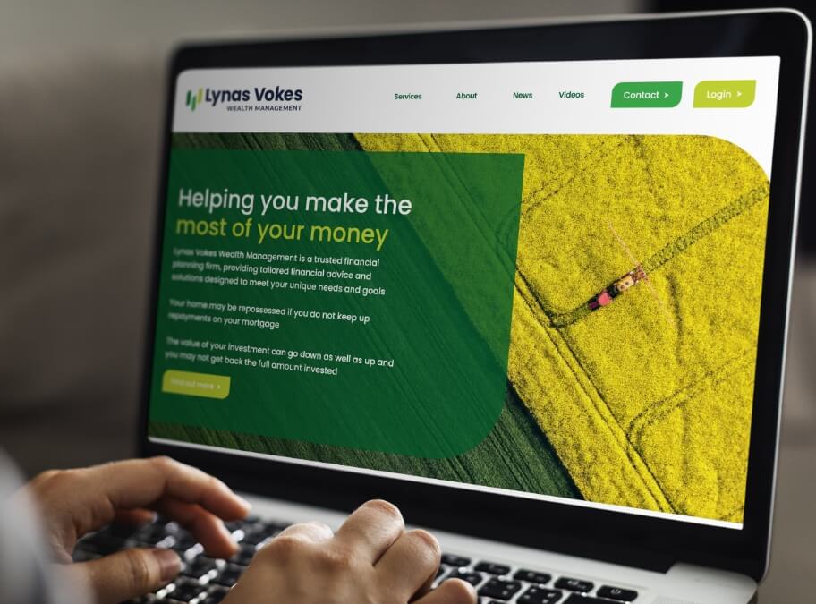
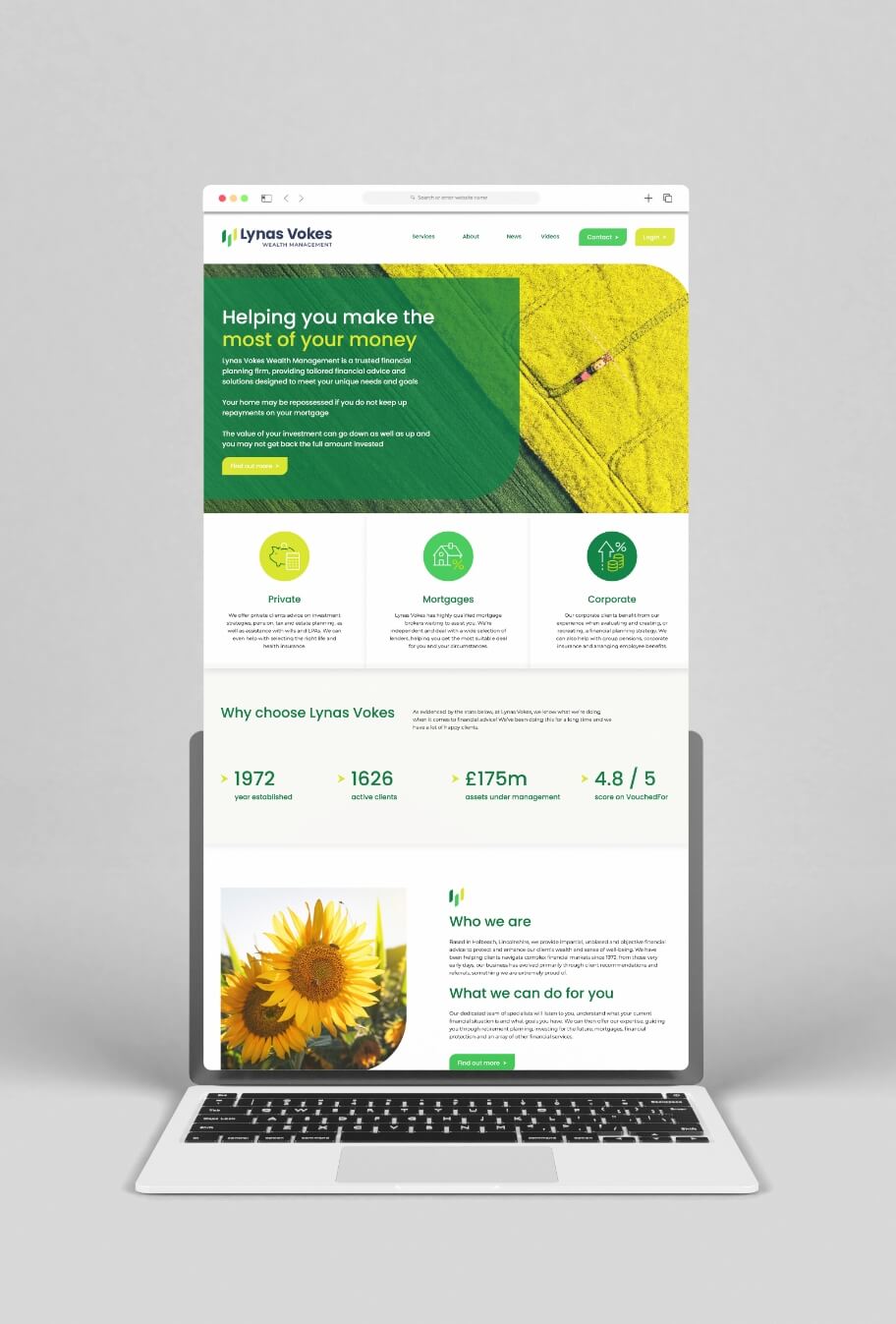
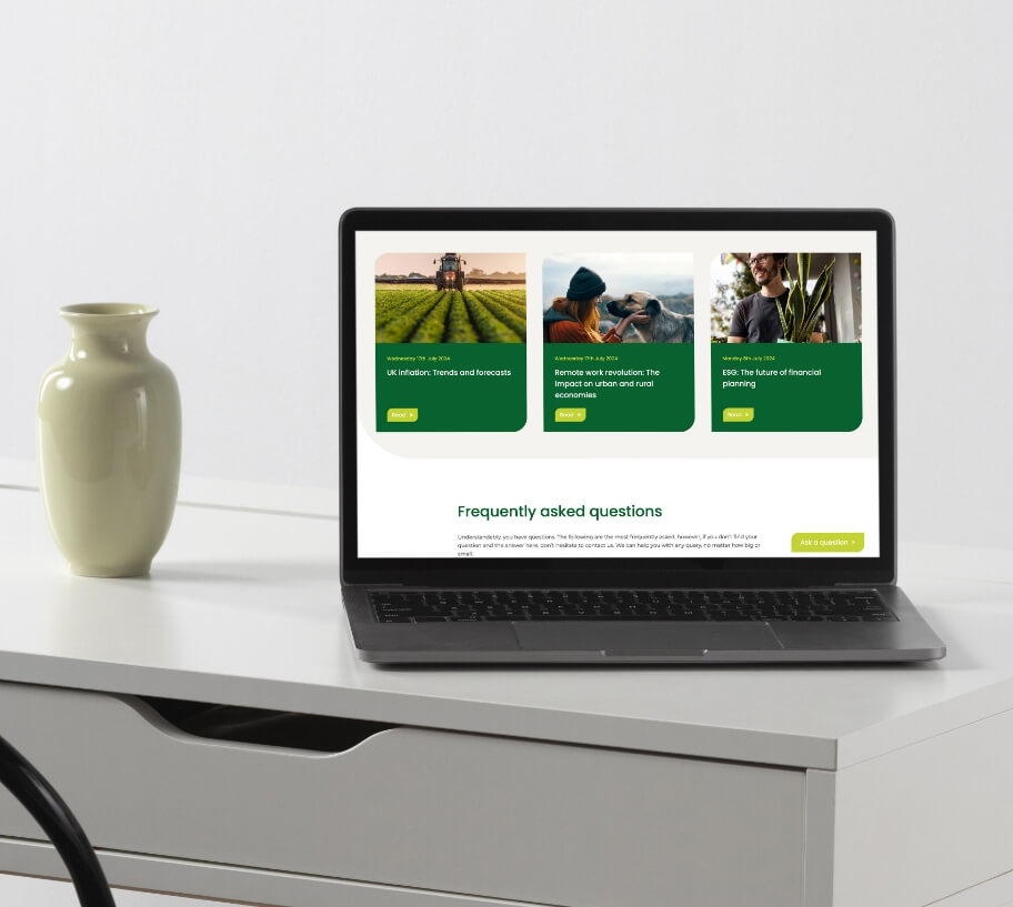
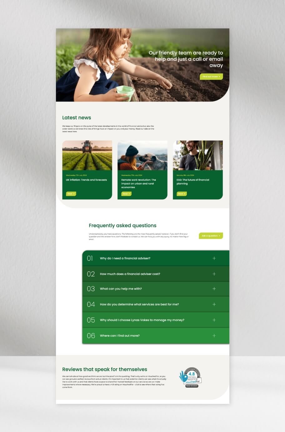
Once we had the updated brand in place, our attention turned to the website which is clean and modern, with lots of white space and pops of the brand colours throughout to draw attention to desired areas. The updated icon shapes were used cleverly throughout the design of the new website to add interest and help the flow of the pages, ensuring it's not just another boxy website. Although this version of the Lynas Vokes website has much more content than the one they came to us with, it is still simple, intuitive and easy to navigate.
It was important to the client that the website not contain the type of stock imagery that is used by lots of other financial services. We were able to find stock imagery that followed the theme of growth in a much more subtle way, with colours that match the new brand colour scheme.
Top features:
- Modernised brand with a wider range of colours
- Clever use of brand shapes and colours throughout the website to reinforce the brand and draw the eye
- Careful use of stock imagery to complement the brand
- Implementation of a mega-menu with lots of white space and use of a secondary menu for intuitive navigation
The result
The client has an updated brand that still feels true to their roots but is more modern and allows them far more flexibility, along with a clean and modern website that reflects the new brand and who they are as a business.